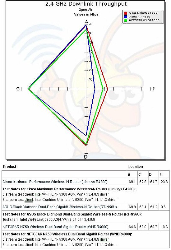
It’s a hard job to compare the performance of wireless routers and access points. Our Wireless Performance Table provides a summary of the throughput values for up to four products. But even with the automatic highlighting of largest values, it’s still a difficult task.
The graphic comparison provided by the Performance vs. Location bar charts is another way to view the data. But it can still be difficult to determine which is the best overall performer of the four products that can be compared at once.
So we’ve added an alternative radar chart view to the Performance vs. Location Chart. The example chart below shows how easy it is to see the overall performance "footprint" of various products. And, of course, the actual throughput values are also available in the table below the chart.

We hope you like this new addition to the best networking product evaluation toolset available anywhere!
