Introduction
Our Wireless Performance Charts provide a variety of ways to view performance test data for wireless products.
Products are tested either using the Azimuth method (older products) or the Open Air method (newer products).
When looking for products, start with the 2.4 GHz Up or Downlink Benchmarks to see both 802.11b/g and draft 802.11n products. The 40 MHz B/W benchmarks apply only to draft 802.11n products.
There are five main data views:
- Average Throughput
- Maximum Throughput
- Feature Summary
- Throughput vs. Path loss or Throughput vs. Location
- Benchmark Comparison
Average and Maximum Throughput
The Average and Maximum Throughput Charts page shown below is used to display the average and maximum wireless throughput of tested products. The drop-down selector allows you to choose the benchmark test for display.
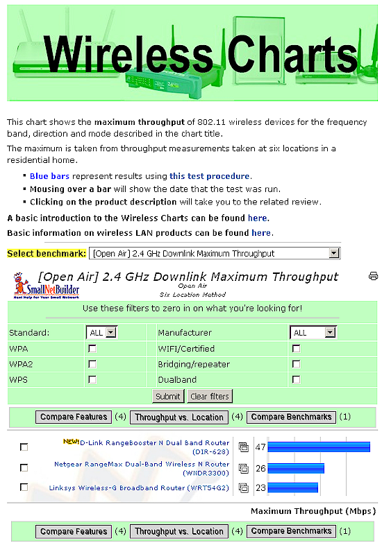
Wireless Average Throughput Chart
The main benchmark groups are:
- Average Throughput (Azimuth method)
- Maximum Throughput (Azimuth method)
- Average Throughput (Open Air method)
- Maximum Throughput (Open Air method)
The Average Throughput charts show the calculated average of all values in the benchmark test, while the Maximum Throughput charts show the highest value from each set of benchmark data.
Each benchmark group also has 2.4 and 5 GHz band and 20 and 40 MHz bandwidth (B/W) tests. 40 MHz bandwidth tests apply only to draft 802.11n products and are designated 40 MHz B/W. 20 MHz bandwidth tests apply to both 802.11b/g and draft 802.11n products and do not have a bandwidth designation.
The Slideshow icon ![]() in the middle column links to product slideshows,and the Print icon
in the middle column links to product slideshows,and the Print icon ![]() at the top of each chart makes it easy to save the info you want.
at the top of each chart makes it easy to save the info you want.
Feature Summary
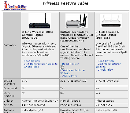
The checkboxes to the left of each product can be used to produce a side-by-side Feature comparison of up to four products (example shown below).
Wireless Product Feature Chart
Throughput vs. Path Loss
For products tested using the Azimuth method, you can also use the checkboxes on the Average / Maximum Throughput page to produce throughput vs. path loss plots for up to six products. These plots allow you to see how wireless throughput changes as signal level decreases. An explanation of the Azimuth method can be found here.
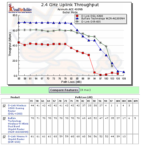
Wireless Throughput vs. Path Loss Chart
Six Location Open Air
For products tested using the Six Location Open Air Method, you can also use the checkboxes on the Average / Maximum Throughput page to produce throughput vs. location charts for up to six products. These charts allow you to see how throughput changes in the six test locations arranged in order of descending signal level.
An explanation of the Six Location Open Air Method can be found here.
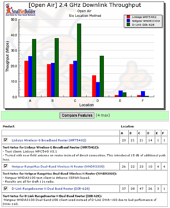
Wireless Throughput vs. Location Chart
Compare Benchmarks
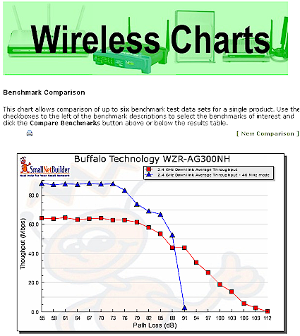
The Compare Benchmark button allows you to plot Throughput vs. Path Loss or Throughput vs. Location (depending on the test method used) for up to six benchmark tests of a single product.
Wireless Benchmark Comparison Chart
As an example, the screenshot above shows download throughput for the Buffalo WZR-AG300NH nFiniti dual-band router for 20 and 40 MHz channel width modes.

