Introduction
Earlier this week, I described how our new Wi-Fi System test process works. While I’m fine-tuning the details and getting some testing under my belt, I figured it would be good to share a sample of what you’ll be seeing from the new process.
To recap, the new process moves testing into RF-tight chambers and uses programmable attenuators to simulate distance between the test client and between Wi-Fi nodes / APs. While the new setup opens up many possibilities for creating new ways to torture these products, the Revision 1 process starts out with a pretty simple approach.
The diagram below presents an easy way to visualize what’s connected to what. The Pal-245 is the octoScope 2×2 test client that’s based on a highly-controllable QCA radio. The five attenuators provide the ability to set the "distance" between system nodes, which affects backhaul performance, and between nodes and test client.
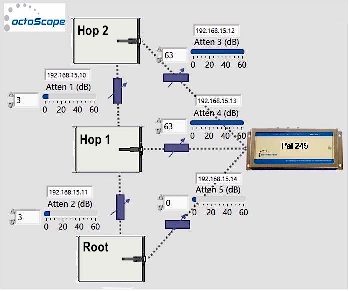
Wi-Fi System test diagram
Only best-case throughput is measured at each node, by setting the attenuator for the node under test to 0 dB. But the Pal device has controls that enable connecting to each radio at each node. So instead of measuring throughput of only whatever connection the client and node negotiate, the new process can measure client throughput on both bands and directions. However, just as in the old process, I make no attempt to control or dig into backhaul; it’s left alone to do its thing.
One point worthy of note is the Pal is allowed to switch to 40 MHz mode in 2.4 GHz if the system being tested supports it. Since the Pal lets me see both transmit and receive link rate as well as channels in use, I can see when this happens and call it out.
Throughput is measured on both bands, in both directions on each of up to three nodes, for a potential total of 12 measurements. The measurements at each node are grouped by band and direction in the Charts database so that a system average can be shown in the default chart view. This is similar to the average view shown in the Router Charts "Profile" benchmarks, which has multiple measurements from the throughput vs. attenuation tests behind it. The example below shows the relationship between those two views.
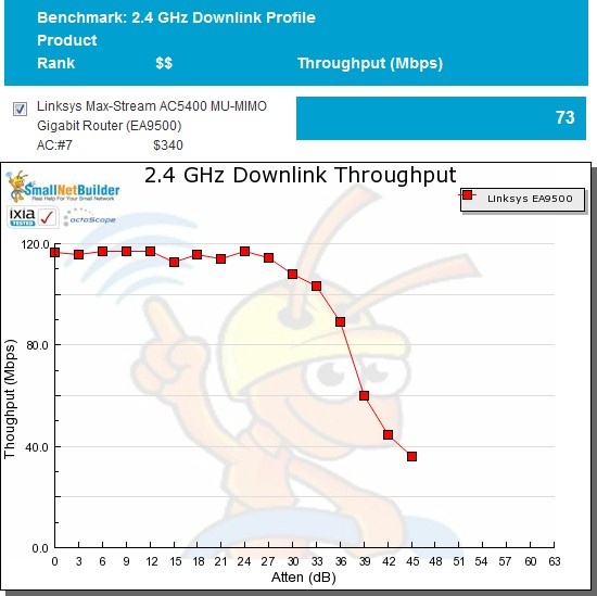
Router charts 2.4 GHz Profile benchmark – average vs. plot view
The Wi-Fi System Chart has a similar relationship between its average and plot views. But the x axis in the plot view is system node instead of attenuation. So the A, B and C in the plot represent the performance measured at the Root, Hop 1 and Hop 2 nodes.
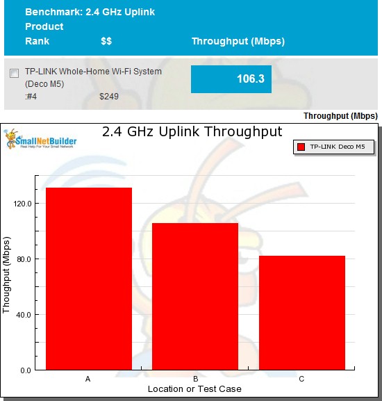
Router charts 2.4 GHz Profile benchmark – average vs. plot view
Now let’s take a look at some results.
Average Throughput
I have measured four products so far with the new process: NETGEAR’s Orbi 2200 (aka Mini) with both its desktop (RBK40) and wall-plugged (RBK30) satellites; TP-Link’s Deco M5 and eero’s now defunct Gen 1. eero Gen 2 samples are in hand, but I’m waiting another week or so for an upcoming firmware upgrade before testing.
The new Orbi is a tri-radio system with a dedicated 5 GHz high-band backhaul and 2×2 AC1300 class client connect radios. But the backhaul radio is 2×2 class vs. 4×4 in the Original Orbi. The original Orbi will be retested, it just didn’t make the cut for this article. Note also that Orbi uses a two piece router / extender design, while the eero and TP-Link products are three element mesh designs. Both of them use the same 2×2 AC1300 class radios for both client and backhaul.
The average 2.4 GHz downlink plot shows both Orbis beating the mesh-style systems for total average throughput. We’ll see why in the throughput vs. location plots shortly.
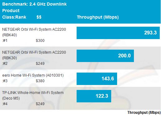
2.4 GHz downlink throughput – average
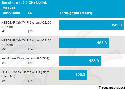
Average 2.4 GHz uplink shows the same relative product placement. I mentioned earlier that I allow the Pal client to use 40 MHz bandwidth in 2.4 GHz. It connected at 400 Mbps link rate for all products, indicating everything was using 40 MHz mode.
2.4 GHz uplink throughput – average
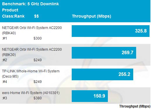
Average 5 GHz downlink again shows both Orbis on top, but the TP-Link Deco is close behind the Orbi with its wall-plugged satellite. I should note that the Root node measurements were reused for the RBK40 and RBK30; only Hop 1 node measurements are different. Note also since Orbi is a two element router / extender design the Wi-Fi System Performance – Extender process described in the Revision 1 article was used.
5 GHz downlink throughput – average
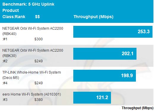
Average 5 GHz uplink shows Deco and wall-plugged Orbi virtually tied for second place.
5 GHz uplink throughput – average
Node Throughput
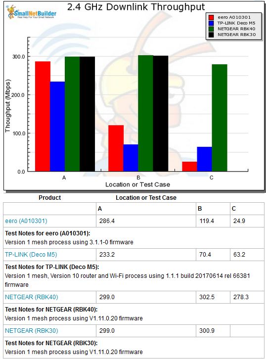
The next set of plots shows throughput measured at each node, which is much more interesting. In the 2.4 GHz downlink plot, the difference Orbi’s dedicated backhaul makes is obvious. There is virtually no drop in throughput from Root to Hop 1. Note since Orbi doesn’t receive then retransmit each packet using the same radio, it technically doesn’t introduce a "hop". But let’s just call it a hop for simplicity, shall we? There is no "C" / Hop 2 data for the wall-plugged RBK30 Orbi because it looks like I didn’t measure it. I’ll get it before the final results are posted in the charts.
Note also the 21 dB of attenuation applied between Orbi’s extender (aka "satellite") doesn’t reduce throughput very much.
2.4 GHz downlink per-node throughput
(Key: A = Root, B = Hop 1, C = Hop 2)
Average 2.4 GHz uplink shows results similar to downlink, except relatively lower throughput for Orbi with 21 dB attenuation applied for the Location C measurement.
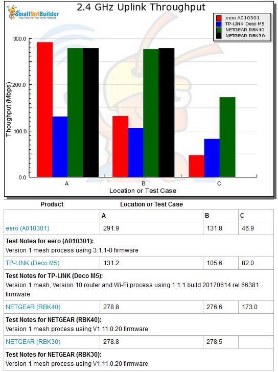
2.4 GHz uplink per-node throughput
Average 5 GHz downlink puts Orbi’s dedicated 2×2 5 GHz backhaul radio to the test. The desktop RBK40 model fares better than the RBK30 wall-plugged, but both manage higher throughput than both TP-Link and eero. All products are running out of steam in Location 2 / Hop 2. Yes, that’s a weenie little bit of throughput for wall-plugged Orbi; I remembered to run that test.
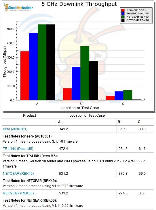
5 GHz downlink tper-node throughput
Average 5 GHz uplink shows similar results. The Orbi RBK30 "0" Mbps result means there was no usable throughput, but the Pal client remained connected.
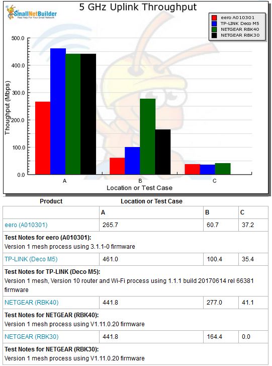
5 GHz uplink per-node throughput
Closing Thoughts
As you have come to expect, SmallNetBuilder’s test process is far and away more comprehensive you’ll find. The octoScope system provides the control needed to really see what’s going on at each node in these multi-module systems. Although final results posted in the charts will also include up and downlink backhaul measurements to each "Hop" node, I didn’t include them here because I’m still characterizing the process.
I’m not quite done with the process, either. I’m putting the finishing touches on a multi-node system capacity test and a maximum range test is also planned. I’m particularly excited about the capacity test; it should really show the strengths and weaknesses of products’ front and backhaul management. Stay tuned!
