Introduction
Updated 7/3/2008 – Corrected radio module information.
Updated 10/31/2007 – Corrected processor and switch part numbers. Removed statement about IEEE Draft 2.0 violation.
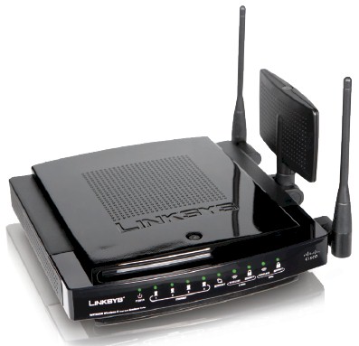
| At a Glance | |
|---|---|
| Product | – Linksys Dual Band Wireless-N Gigabit Router with Storage Link(WRT600N) – Linksys Dual Band Wireless-N Notebook Adapter (WPC600N) |
| Summary | Broadcom-based dual-band Wi-Fi Certified 802.11n Draft 2.0 router with 10/100/1000 WAN and LAN and NAS support |
| Pros | • Two radios for simultaneous dual-band operation • Four-level priority-based QoS and WMM support • NAS features with external USB drive |
| Cons | • No WPS • Relatively expensive |
Linksys almost announced the WRT600N back in January at CES. They decided not to go forward with it at the last minute, but not before exposing it enough to make its existence widely known. D-Link took a similar tack, but instead actually announced its dual-band DIR-855, which is still marked as "Coming Soon" on its website.
Well, last week Linksys finally officially unleashed its dual-band Draft 11n offering and was kind enough to ensure that we got one of the first batch. This makes the 600N the second two-radio simultaneous dual-band draft 11n router available (the currently unavailable Buffalo WZR-AG300NH is the other), which has many potential wireless LAN upgraders chompin’ at the bit to spend their money.
The 600N has the same package style as its single-band sibling, the WRT350N, but opts for an all-black look to convey an impression of power and elegance. Figures 1 and 2 detail the front and back panels, but omit mention of the top-of-case "Reserved" button.
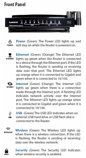
Figure 1: WRT600N Front Panel
If previous designs are any indication, this will be used to kick off a Wi-Fi Protected Setup (WPS) session, once Linksys gets around to adding that function in a future firmware update. For now, however, you’ll need to use Linksys’ EasyLink Advisor application or set up wireless security manually. If you want more about EasyLink Advisor, as well as commentary on other features, see Glenn Fleishman’s WRT600N review.
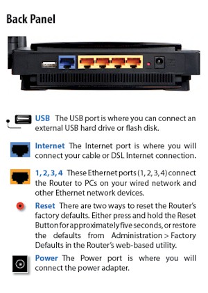
Figure 2: WRT600N Rear Panel
Internal details
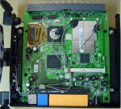
Figure 3 is a shot of the 600N taken from the FCC filings. I’m including it because even though it has the messiness common to pre-release product photos, it shows component details that I couldn’t get with the released product. This is because, like the Apple Airport Extreme [reviewed], the 600N uses large aluminum plates to suck the heat away from toasty components. But, unlike the Apple, the top plate seems to be permanently bonded to the board.
Updated 7/3/2008 – Corrected radio module information.
The FCC photos show a Broadcom BCM4705 processor , BCM5397 5 port gigabit switch and two Broadcom Intensi-fi-based mini-PCI radio boards. The bottom board is marked "Broadcom BCM94321MP" and is a dual-band mini-PCI board used as the 2.4 GHz band radio, based on a BCM4321 BB/MAC and BCM2055 radio.
Figure 3: FCC photo of WRT600N main board
For some reason, a different board is used for the 5 GHz mini-PCI radio, which sits on top of the main board. The only thing that the FCC ID photos reveals is that it uses the same BCM4321 BB/MAC as the 2.4 GHz radio.
Note that while the BCM5397 switch chip supports jumbo frames up to 9k, Linksys says (and a quick test confirmed) the 600N does not.
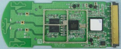
Figure 4 shows the companion WPC600N Notebook Adapter internal view, which also uses a dual-band Broadcom Intensi-fi chipset.
Figure 4: Linksys WPC600N Notebook card board
![]() See the Slideshow for more internal photos.
See the Slideshow for more internal photos.
Routing Features
I’m not going to spend a lot of time detailing the 600N’s routing features, since there isn’t much that you won’t find on other current-generation Linksys routers. All of the usual suspects are there, including:
- DHCP, Static, PPPoE, PPTP, L2TP, Telstra Cable WAN types
- Built-in Dynamic DNS clients for TZO and DynDNS
- Static and dynamic routing
- SPI firewall disable, multicast, WAN ping and IDENT filtering and Proxy, Java, ActiveX and Cooking blocking
- IPsec, PPTP and L2TP VPN passthrough (enabled by default)
- Single port forwarding and Port Range forwarding and triggered ports
- HTTPS admin access, remote management (HTTP / HTTPS) enable with IP range restriction and port setting
- Logging with support for Linksys Logviewer recording
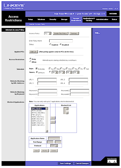
I thought the Access Restrictions admin page (Figure 5) was worth a look, since there is a lot going on. You can define only 10 deny or allow-based policies, but each can have its own list of clients that it applies to, as well as a day/time schedule that the restrictions apply. The clients can be specified by a mix of MAC address, IP address and IP address range. Note that only three applications can be blocked per policy.
Figure 5: Access Restrictions
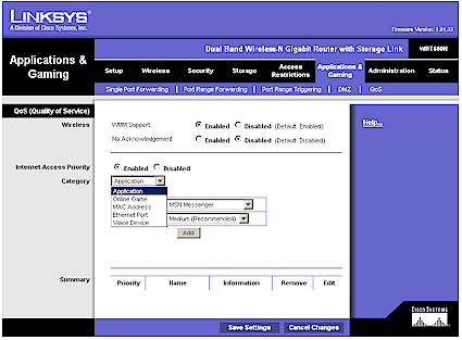
The QoS tab holds the WMM (Wireless MultiMedia) (enabled by default) and Internet Access Priority controls. The latter allows assignment of High, Medium, Normal or Low priority to either specific applications (divided into Application, Online Game and Voice Device groups), physical switch ports or specific MAC addresses. The priority is for uplink (LAN to WAN) traffic only.
Figure 6: QoS Features
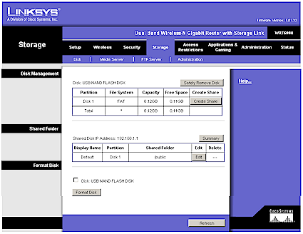
Like the Apple Airport Extreme and its single-band sibling the WRT350N, the 600N supports network file sharing if you attach an external USB drive. It’s not listed in any of the documentation, but Linksys told me that FAT32 and NTFS formatted drives are supported. They also said they had tested drive sizes up to 750 GB.
Figure 7: Disk Management
I found the controls to be a bit funky, requiring multiple attempts on my part to successfully set up an accessible share from an XP SP2 machine. I was not able to set up a share that didn’t pop up a Windows login box, and the Guest account with a NO PASSWORD password didn’t work either.
The Windows Workgroup name is fixed at "Linksys" and network browsing was problematic (I kept encountering login pop-ups). So I resorted to accessing shares by IP address that seemed to work to let me set up a mapped drive, which I suspect most users will do.
Routing Features – more
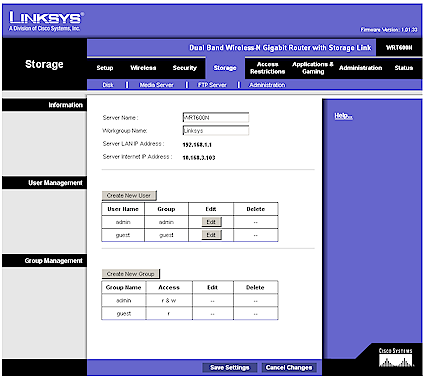
Figure 8 shows that both User and Group level permissions are supported (the Admin and Guest accounts come pre-set).
Figure 8: Disk Admin (Users and Groups)
Since I neglected to test the Airport Extreme’s NAS feature performance, I made sure that I put NAS testing on my to-do list for this review. Figure 8a shows read and write results for large file sizes with a gigabit LAN connection. The large filesize write and read average throughputs of 3.8 and 4.4 MBytes/sec, respectively, place the 600N dead last in our 1000 Mbps NAS chart rankings.
The 1000 Mbps ranking with small filesizes places the 600N about mid-chart with 76.8 MB/s, but next to last for read with 7.8 MB/s.
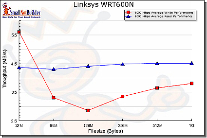
Figure 8a: NAS Performance – 1000 Mbps LAN connection
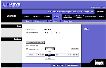
A UPnP AV media server can be enabled (disabled by default), with the only other control being a directory scan interval. I didn’t test this server.
Figure 9: Media Server
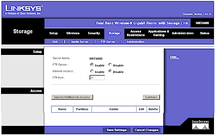
The last server included is an FTP (the ProFTPD 1.3.0 Server, actually), which is disabled by default. Figure 10 shows that you can set the server port and enable Internet access, as well as set up special FTP folders to access.
Figure 10: FTP Server
I confirmed that the Internet Access feature works by setting the FTP port to 210, then successfully connecting to an FTP session on the WAN side of the router. But the opened port doesn’t appear anywhere in the Status or Applications & Gaming pages, an omission that should be fixed.
The FTP folders appear to be separate from the network shares, with their own "partitions". I had similar problems setting up FTP folders as I did in setting up shares, but this time wasn’t able to successfully set up an FTP folder. In all, both the file and FTP folder setup and editing could use some work to make them more reliable and easier to use. You should also be able to use the web interface to browse and access all FTP and share folders.
Note that the 600N does not include a USB print server.
Routing Performance
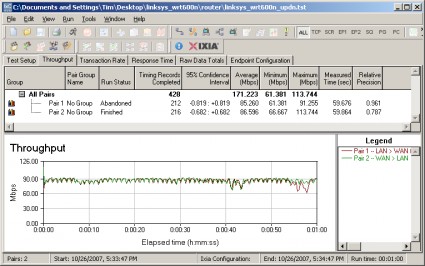
I tested routing performance using our standard router tests, using desktop machines running Windows XP SP2 for both IxChariot endpoints, since both had gigabit Ethernet LAN cards. All tests were done with the LAN client in DMZ, but I had problems getting the LAN to WAN tests to complete. This was probably due to the 600N’s use of an SPI+NAT firewall, which usually causes problems with IxChariot test completion. This accounts for the "Abandoned" notation you’ll see in the performance plots.
Table 1 shows around 171 Mbps of total simultaneous routing throughput, which places it in the #4 slot in our current Router Performance Charts. The 136 simultaneous connections are a bit disappointing, but the highest for any Linksys router I’ve tested to date.
| Test Description | Throughput (Mbps) |
|---|---|
| WAN – LAN |
164
|
| LAN – WAN |
159
|
| Total Simultaneous |
171
|
| Maximum Simultaneous Connections | 136 |
| Firmware Version |
1.01.33
|
Table 1: Routing performance
Figure 11 shows throughput variation for simultaneous up and downlink traffic, which is balanced and pretty well-behaved.
Figure 11: Linksys WRT600N simultaneous routing throughput
Wireless Features
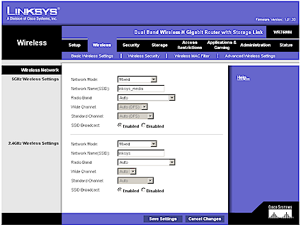
Except for 802.11n-specific controls, the 600N’s wireless settings will be familiar to anyone who has driven any other Linksys wireless router. Network Mode offers the options of Mixed, Wireless-A only or Wireless-G only (for the 5 GHz and 2.4 GHz radios, respectively) and Disable. The Radio Band control is where you can force use of 20 MHz or 40 MHz (channel bonded) wide channels.
Figure 12: Basic Wireless settings
The default settings of Auto put both radios into 40 MHz channel mode. This is ok for the 5 GHz radio, but is in violation of the Wi-Fi Alliance’s 802.11n Draft 2.0 Certification process. The Alliance’s Draft 2.0 Certification requirements call for "out of the box" operation in 2.4 GHz to default to using a legacy-friendly 20 MHz channel.
|
The Alliance would not comment for my previous story. I suppose I can’t blame them, since the obvious hole in their Certification test process may have let through more products than just the 600N. I asked Linksys what they intend to do to bring the 600N into Draft 2 compliance and this was their response:
… which bounces the ball back to the Alliance. This error gives Linksys a performance advantage in the 2.4 GHz band by defaulting to a 40 MHz channel, which provides higher bandwidth. You would think that Linksys’ competitors would be pressuring the Alliance to fix their process and require any vendor with non-conforming, but Certified, product to bring the product into compliance or risk losing their Certification. But if that is happening, it’s not obvious. |
Note that in order to set the Wide or Standard Channel, you must change the Radio Band from Auto. The Standard Channel setting is what you would think it is—the same as the channel setting for any 802.11a,b or g gear. But the Wide Channel is misleading and does not convey what the hardware is acutally doing.
The short story is that when a 40 MHz channel is used, the Extension channel is always 4 channels away from the Primary channel for 2.4 GHz radios. So, you can’t really directly select the second, Extension, channel anyway and the Wide Channel setting is not needed. What’s worse, however, is that the Wireless Status page uses the same misleading nomenclature, instead of reporting the actual channels in use.
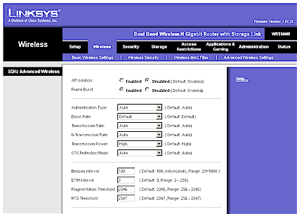
Moving on to the Advanced settings, it’s nice to see the AP Isolation, which keeps wireless clients from communicating with each other. So if you happen to forget to disable File and Printer sharing and have an open share, you won’t get pwned.
Linksys’ description of the Frame Burst control doesnt’ shed much light on what it’s actually doing. But if you are having trouble getting clients to connect or stay connected, you should try disabling it. The other controls on this page are pretty standard, so I won’t go into them.
Figure 13: Advanced Wireless settings
Note that there is no transmit power control for either radio, nor is there a control to convert the 600N to function as an access point instead of a router. Finally, unlike the Apple Airport Extreme, the 600N doesn’t support WDS bridging and repeating.
Wireless Performance
I tested the 600N using our new wireless test procedures, which use both open-air testing and Azimuth’s ACE 400NB Channel Emulator.
A Linksys WPC600N Cardbus card was inserted into a Fujitsu P7120 Lifebook (1.2 GHz Intel Pentium M, 504 MB) notebook running WinXP Pro SP2 with all the latest updates. I used the 4.150.31.0 driver with the Linksys client application running.
The router had 1.01.33 "Draft 2.0" firmware and I left all factory default settings in place, except as noted.
Maximum Throughput – 2.4 GHz
To start, I ran some close range open-air IxChariot test to look at maximum performance and throughput variation. This also provides baselines to check the Azimuth results against. Testing was done with the router and notebook about 10 feet apart in open air sitting in my lab with no other networks in range.
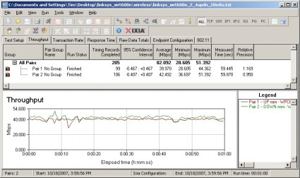
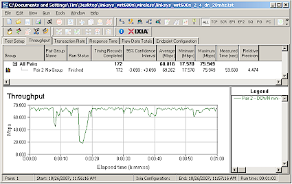
Figure 14 shows simultaneous up and downlink results in the 2.4 GHz band with the mode forced from its default of Auto to its Standard – 20 MHz Channel mode, which yields around 82 Mbps of total throughput. Running up and downlink separately yielded results of 64 and 69 Mbps respectively.
Figure 14: Up and downlink throughput – 2.4 GHz band, 20 MHz bandwidth
There is an anomaly in the 600N’s throughput characteristic that is worth noting, since it has the effect of lowering average throughput. Figure 15 shows 2.4 GHz downlink throughput where you can see a large throughput "dropout" around the 16 second mark. This same effect is seen in varying degrees in both bands and in both 20 and 40 MHz channel modes.
Figure 15: Downlink throughput – 2.4 GHz band, 20 MHz bandwidth
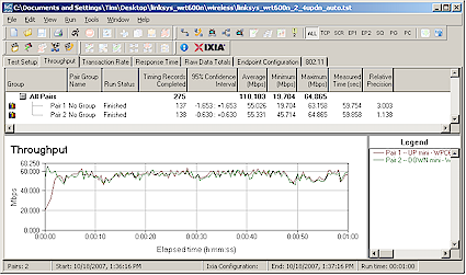
Switching back to the default Auto mode resulted in the 600N’s using a 40 MHz channel bandwidth, with a subsequent improvement of total up and downlink throughput to 110 Mbps (Figure 16). Unfortunately, you can’t exceed the 100 Mbps mark running up or downlink alone, even using bonded channels. Running up and downlink separately yielded results of 73 and 85 Mbps respectively.
Figure 16: Up and downlink throughput – 2.4 GHz band, 40 MHz bandwidth
Maximum Throughput – 5 GHz
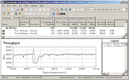
I next checked throughput in the 5 GHz band. Like the Apple [reviewed] and Buffalo [reviewed] dual-band routers, the 600N defaults to using 40 MHz channel bandwidth (actually, its Auto mode), so that’s what I tested first. The total throughput of 112 Mbps is essentially the same as achieved with channel-bonded 2.4 GHz operation, which is nice to see (Figure 17).
But, as in 2.4 GHz, you can’t exceed 100 Mbps running up or downlink only, which clocked in at 80 and 83 Mbps respectively. Note that the average throughput would have been closer to 120 Mbps, if not for the multi-second glitch around 15 seconds into the test.
Figure 17: Up and downlink throughput – 5 GHz band, 40 MHz bandwidth
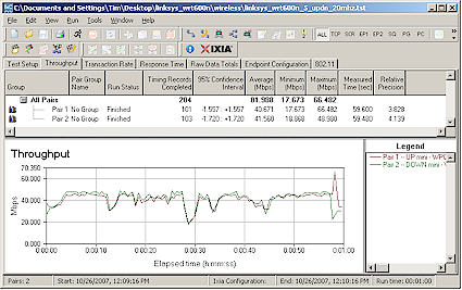
Shifting down to 20 MHz bandwidth mode, total up/down throughput drops to around 82 Mbps (Figure 18), which is virtually identical to the 2.4 GHz, 20 MHz channel results. Throughput is a little choppier, which appears to come from the uplink side. Running up and downlink only turned in 1 minute average throughputs of 66 and 72 Mbps, respectively.
Figure 18: Up and downlink throughput – 5 GHz band, 20 MHz bandwidth
Security mode throughput
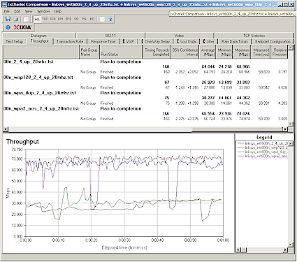
The 600N did a bit better than most Draft 11n routers in terms of throughput loss when using WEP or WPA-TKIP wireless security. Figure 19, taken with the 2.4 GHz radio running uplink in 20 MHz channel mode, shows 60% and 53% losses respectively in downlink tests.
While this is better than the 90% WEP throughput loss seen in Atheros XSPAN-based products such as the Apple Airport Extreme, it’s not as good as the 30% WEP loss I found in the Marvell TopDog-based Netgear RangeMax NEXT Wireless-N Router – Gigabit Edition [reviewed].
Figure 19: Security mode throughput comparison – uplink
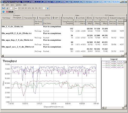
Downlink loss is a bit better for WEP 128, which comes in closer to the 50% WPA-TKIP loss (Figure 20).
Figure 20: Security mode throughput comparison – downlink
The good news is that WPA2/AES showed no significant throughput loss in both up and downlink modes. So, once again, it’s the wireless security mode you should be running if maximum throughput matters.
Throughput vs. Path Loss
NOTE: We no longer refer to "range" in these plots, but instead use the more accurate "Path Loss". For an explanation, see the How we Test Wireless article.
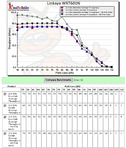
Figure 21 was generated using the Compare Benchmarks tool of our Wireless Charts and shows 2.4 GHz up and downlink performance in 20 and 40 MHz channel modes. The 40 MHz channel width seems to provide a meaningful throughput boost only when running downlink. Again, note that the multi-second throughput dropout that I mentioned earlier tends to move these throughput values downward. (Each point on the plot is the average throughput for a 1 minute test.)
Figure 21: Throughput vs. Path Loss – 2.4GHz
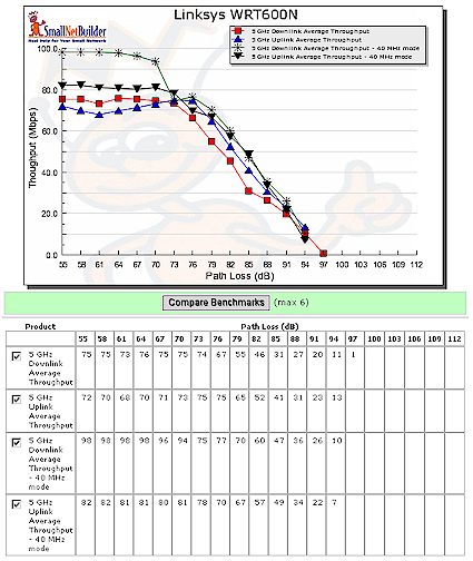
Figure 22 shows performance in the 5 GHz band, which also includes both 20 and 40 MHz channel modes. Once again, the curves are similar except for downlink with a 40 MHz channel. That throughput starts out close to 100 Mbps, but then drops to merge with the other curve once the "waterfall" portion of the curve is hit.
Even though the plots don’t reflect the difference in real-world signal attenuation between 2.4 and 5 GHz, the 5 GHz curves end significantly sooner than the 2.4. This indicates that 5 GHz range will be noticeably smaller than 2.4.
NOTE: 2.4 GHz and 5 GHz test results can only be compared within each frequency band. The Azimuth system does not reflect the difference in signal attenuation between the bands in the mathematical models it uses.
Figure 22: Throughput vs. Path Loss – 5GHz
Throughput vs. Path Loss – Product Comparison
So how does the 600N compare to the other dual-band options available? Pickin’s are still slim for dual-band, but we can compare the 600n to the Apple Airport Extreme (Atheros XSPAN) and Buffalo WZR-AG300NH dual-band (Marvell Topdog). Since you can use the Wireless Charts to generate the plots you want, I’m going to show only comparisons using 20 MHz channel mode in 2.4 GHz and 40 MHz channel mode in 5 GHz, since those are the defaults.
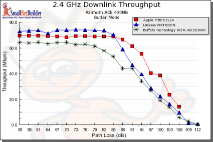
Figure 23 shows the 600N having the highest throughput under 2.4 GHz downlink strong-signal conditions, but then falling below the Apple Airport Extreme as path loss increases.
Figure 23: Throughput vs. Path Loss product comparison – 2.4 GHz downlink
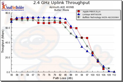
Uplink in 2.4 GHz with 20 MHz channel (Figure 24) shows a similar pattern, but this time the 600N’s throughput falls below both the Apple and Buffalo products as signals grow weaker.
Figure 24: Throughput vs. Path Loss product comparison – 2.4 GHz uplink
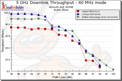
In the 5 GHz plots, the Apple Airport Extreme is running at a disadvantage, since it was not tested with an Atheros-based client. And it’s hard to say whether the Buffalo dual-band or 600N is superior, since they trade positions multiple times over the curve.
Figure 25: Throughput vs. Path Loss product comparison – 5 GHz downlink
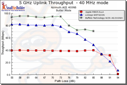
But with 5 GHz / 40 MHz channel uplink (Figure 26), the 600N appears to be the better choice than the Buffalo. But even though the Apple’s throughput is lower (most likely due to the mismatched client), it has the same range as the 600N.
Figure 26: Throughput vs. Path Loss product comparison – 5 GHz downlink
Mixed STAs
From my previous testing, I’ve reached the conclusion that it’s a lose-lose deal to run a WLAN with a mixture of draft 11n and 11g clients. You would think that with typically around 70 or 80 Mbps of usable bandwidth that there would be plenty to spare so that both clients didn’t noticeably suffer. But, unfortunately, that hasn’t been the case in the past, and the 600N is no exception.
I set up my usual test using a second notebook with a Linksys WPC54G V3 11b/g card (Broadcom chipset). Both it and the Fujitsu notebook with WPC600N card were associated with the 600N, which was set to its 2.4 GHz Standard – 20 MHz Channel mode, to simulate what should be its proper "out of the box" settings. I then ran two IxChariot throughput.scr streams, alternating the STA that got on the air first.
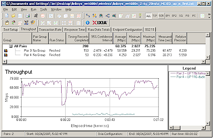
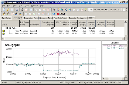
Figure 27 shows how uplink throughput was shared when the 11n pair started first, while Figure 28 shows the 11g pair starting first.
Figure 27: Mixed 11n, 11g STAs – Uplink, N starts first
The results follow the pattern that I’ve seen with other draft 11n products,i.e. the 11g STA gets knocked down to 11b speeds. In this case the 11g throughput is knocked down to about 4 Mbps from its normal 20 Mbps or so, or about 80%. The 11n pair also gets a throughput hit, but still manages to run at about 50 Mbps when the 11g STA is on the air.
Figure 28: Mixed 11n, 11g STAs – Uplink, G starts first
The 11g client does a little better running downlink since it manages to run at around 11 Mbps when sharing the air with the WPC600N.
Legacy Neighbor WLAN Tests
My last set of tests checked the Clear Channel Assessment (CCA) mechanism that is supposed to ensure "neighbor friendly" operation with legacy WLANs. (See this page for an explanation of CCA).
For this test, I configured the 600N as an AP, set to Auto mode, Standard Channel 1 and no encryption. This made Channel 1 the primary channel and Channel 5 the extension.
I then set up a second wireless LAN using a Linksys WRT54G router (original rev) and WPC54G V3 CardBus card. The WRT54G had most recent firmware and was set to its default Mixed mode and Channel 5—the extension channel. I also operated it as an AP and connected it to the same switch that the 600N was connected to.
Two IxChariot throughput.scr scripts were used to drive traffic to both 11n and 11g test pairs. I tested both uplink and downlink traffic and alternated between having the 11n and 11g WLANs start first. (If you need a diagram of the test setup, this one showing a similar test setup should give you the basic idea.) I also used the Cognio Spectrum Expert to monitor spectrum use.
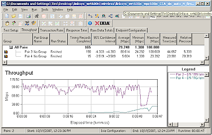
Figure 29: CCA Test – Downlink, N starts first
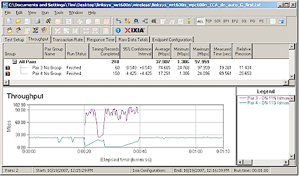
As has been the case with all other Draft 2.0 11n products, the 11n products dominate and severly reduce the throughput of the 11g WLAN operating on the extension channel. Spectrum monitoring shows that the 11n WLAN continues to operate with 40 MHz of bandwidth, regardless of 11g WLAN activity.
I have to say that the 600N seems a bit better than other products in that it doesn’t completely knock the 11g WLAN off the air, as shown in Figures 29 and 30. But there is still no evidence that the 600N switches to 20 MHz channel mode when there is a legacy WLAN operating in its extension channel.
Figure 30: CCA Test – Downlink, G starts first
Closing Thoughts
Regular readers will know that I recommend spending the extra bucks for dual-band when it comes time for you to make the move to draft 11n. While manufacturers are offering dual-band single-radio models at slightly lower price points, two radios make the most sense if you’re going to have a one-router setup. The relatively small cost savings pales in light of the greatly enhanced flexibility provided by two radios.
Some buyers seem to share my opinion, given the frequent frustrated inquiries I have gotten during the past year about the availability of the dual-band, dual-radio D-Link DIR-855, which has yet to ship. Perhaps now that Linksys has finally decided to go to market, D-Link will soon follow suit.
But, for now, there are only two dual-band draft 11n players on the field since Buffalo is, I hope, only temporarily sidelined by its CSIRO woes. Both the Apple Airport Extreme and the 600N have similar feature sets, including NAS functions if you add an external USB drive. And both are equal enough in routing and wireless performance to have the decision boil down to a cost / benefit tradeoff.
If you really need simultaneous dual-band draft 11n today, the 600N should serve your needs well. But I’d wait a bit if you can, since it looks like the next 3 – 6 months will see more dual-band products appear. It will also give Linksys some time to get out a firmware rev or two to smooth the rough edges in an otherwise good product.

