Introduction
Our Router and NAS Charts have set the standard for presenting performance and key feature information for these very popular product categories. And now, our new Wireless Charts follow in that tradition, presenting for the first time anywhere wireless throughput performance profiles for products’ entire operating range!
The Wireless Charts follow a similar format to our NAS Charts, with three main views: Average Throughput, Feature Summary and Throughput vs. Path Loss.
Average Throughput
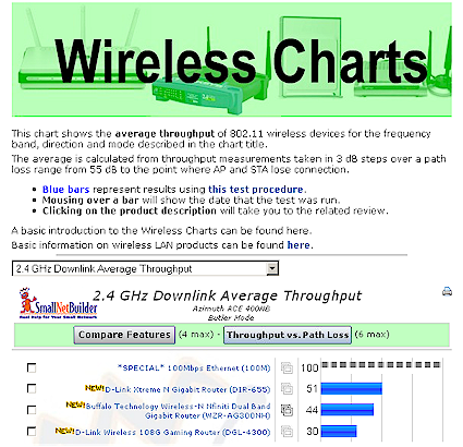
The Average Throughput Chart page shown below shows the average throughput of each product’s entire operating signal range. Throughput measurements are made using IxChariot and Azimuth’s ACE 400NB Channel Emulator. Full details on the measurement techniques can be found here.
Wireless Average Throughput Chart
The Slideshow icon ![]() in the middle column links to product slideshows,and the Print icon
in the middle column links to product slideshows,and the Print icon ![]() at the top of each chart makes it easy to save the info you want.
at the top of each chart makes it easy to save the info you want.
Feature Summary
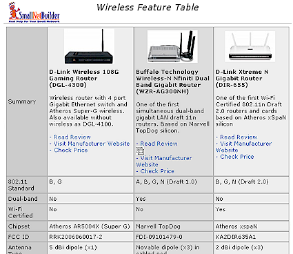
The checkboxes to the left of each product can be used to produce a side-by-side Feature comparison of up to four products (example shown below).
Wireless Product Feature Chart
Throughput vs. Path Loss
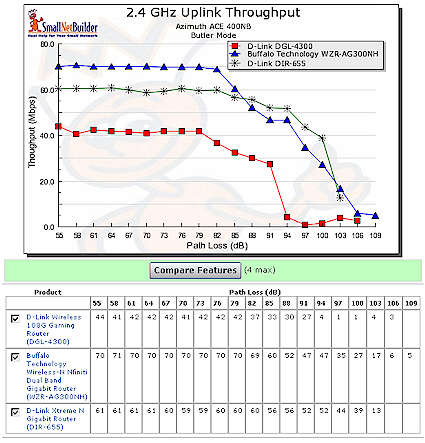
You can also use the checkboxes on the Average Throughput page to produce throughput vs. path loss plots for up to six products. These plots, which you won’t find anywhere else, allow you to compare actual performance to manufacturers’ claims.
Wireless Throughput vs. Path Loss Chart
Compare Benchmarks
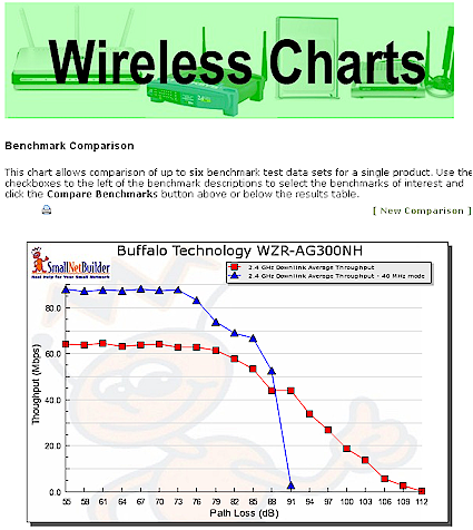
The Wireless Charts also include a new feature—Benchmark Comparison. The new Compare Benchmark button that you’ll find on the Average Throughput charts allows you to plot Throughput vs. Path Loss for up to six benchmark tests.
Wireless Benchmark Comparison Chart
As an example, the screenshot above shows download throughput for the Buffalo WZR-AG300NH nFiniti dual-band router for 20 and 40 MHz channel width modes.
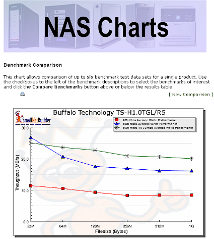
The new Compare Benchmarks features is also available in the NAS Performance Charts. The screenshot below shows write performance for the Buffalo TeraStation Pro II with 100, 1000 and 1000 Mbps / 4k Jumbo frame LAN connections. As noted above, you can compare results for up to six benchmark tests for a single product at a time.
NAS Benchmark Comparison Chart
We hope you find this new feature to be as helpful as we do!
You can access the new Wireless Charts here.
As always, we want your feedback. So drop us a line and share your thoughts on the new charts. Enjoy!

